How to Implement a Password Reveal
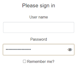
Passwords are becoming more complex, making it easier to make a typo. Edge added a password reveal feature that is quite handy.
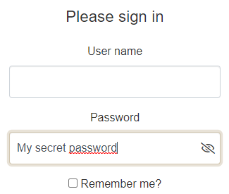
The basic idea is simple: add a button that switches the input's type between password and text when the user clicks on it. Edge's feature is a little more sophisticated as the reveal button is visible if and only if the input was empty any time since the input got the focus, as the following flowchart explains it:
Implement the behavior
To implement this, you need an HTML element serving as a visual cue to click on to reveal/unreveal the password, and a wrapper element to setup the display. Then, you just need a few attributes to store the states and some event listener to register.
document.querySelectorAll('input[type=password]').forEach(function (input) {
    const cue = document.createElement("span");
    cue.setAttribute('aria-hidden', 'true');

    const wrapper = document.createElement("span");
    wrapper.classList.add('input-wrapper');

    input.parentNode.insertBefore(wrapper, input);
    wrapper.appendChild(input);
    wrapper.appendChild(cue);

    let reveal = false;
    const checkReveal = function () {
        input.dataset.reveal = Boolean(reveal |= !input.value);
        input.dataset.valueLength = input.value.length;
    };

    input.addEventListener('focus', function () {
        input.addEventListener('input', checkReveal);
        input.dataset.reveal = Boolean(reveal = !input.value);
        input.dataset.valueLength = input.value.length;
    }, { passive: true });
    input.addEventListener('blur', function () {
        input.setAttribute('type', 'password');
        input.dataset.reveal = reveal = false;
        input.removeEventListener('input', checkReveal);
    }, { passive: true });

    cue.addEventListener('mousedown', function (e) {
        e.preventDefault();
        const type = input.getAttribute('type') === 'password' ? 'text' : 'password';
        input.setAttribute('type', type);
    });
});
The attribute data-reveal indicates whether the reveal button should be displayed, and the data-value-length contains the length of the password. When the password length is 0, then data-reveal is set to true and when the length is not 0 anymore, the button is made visible.
On the cue, the mousedown event, with default behavior prevented, toggles the reveal of the password. This way, we can prevent the input from loosing the focus. it is not possible on a click event.
The other listeners are passive, as they do not call preventDefault.
Then style the widget
The .input-wrapper element set the position property to relative, so the visual cue for toggling can be positionned absolutely.
Then it is simply a matter of setting the necessary properties to display the appropriate icons, based on the state of the input .
Note that the following rule hides the native edge cues when the input has been setup with our reveal behavior.
input[data-reveal]::-ms-reveal {
  display: none;
}
The following scss code can be used to display the visual cues:
.input-wrapper {
    position: relative;
    display: block;
}

input[data-reveal]::-ms-reveal, input[data-reveal] + [aria-hidden] {
    display: none;
}

input[data-reveal=true]:not([data-value-length='0']) {
    padding-right: calc(#{$fa-fw-width} + 1rem);

    & + [aria-hidden] {
        speak: none;
        font-family: FontIcons;
        font-weight: normal;
        box-sizing: content-box;
        padding: 0.25rem 0.5rem;
        height: calc(100% - 0.5rem);
        width: $fa-fw-width;
        position: absolute;
        top: 0;
        right: 0;
        display: flex;
        justify-content: center;
        align-content: center;
        flex-direction: column;
        z-index: 1000;
    }

    &[type=password] + [aria-hidden]::before {
        content: fa-content($fa-var-eye);
    }

    &[type=text] + [aria-hidden]:before {
        content: fa-content($fa-var-eye-slash);
    }
}
The right-padding of the input, as well as the z-index of the visual cue, have been set to make room for the visual cue and keep it visible when the input has the focus.
Also, the following rules are set to center the icon vertically and horizontally:
  display: flex;
  justify-content: center;
  align-content: center;
  flex-direction: column;
  z-index: 1000;
On a closing note, there are two noticeable differences with the Edge's password reveal:
- The password does not reveal on Alt+F8
- The input keeps the focus when clicking on the visual cue.
Also, like Edge's password reveal, the input does not detect the password as reveallable when you select all the text and replaces it. You have to empty the input first.